Learn to create stunning Landing pages in aweber
Do you want your subscribers to buy your products and services? Then what you need is an effective landing page!
Having an efficient landing page can be very beneficial, the art of email marketing is more than just sending an email to your customers. It is a way to get your products and services to those that need your products and services.
The best landing pages are those that can effectively capture the consumer's attention according to the true list a well-tailored landing page can increase your conversion by 300%. No this is not a joke it's a fact a landing page that is tailored for your customer's needs has the potential to get your customer to sign up or purchase your product.
But first, there are a couple of things that need to be done let's face it marketing to your audience is not an easy task. So you need to create stunning content that creates value for your visitors. If your visitors do not see the value that your product has to offer, then they won't sign up or buy. This is not the idea at all: your blood and sweat are invested in your business for your intended customer who does not buy from you.
I know how it is, if you are anything like me we spend hours and days in front of the computer to get our business off the ground, and not all the time it works like clockwork. Well, I have some tips that can help you not make the same mistakes I made when I first started.
Keep a clean design
Many landing pages suffer because there is too much going on in the background, and at times it can be very confusing or even tiring to the eyes. Keeping your landing page organized and clean, can help with conversion and make it easy for your consumer to digest the content without getting frustrated and leaving.
Focus on the Primary Goals of the Campaign
The idea of your landing page is to steer your consumer to convert if it is an e-commerce landing page then the idea is to get him to buy the product or if you just simply want him to sign up. Then we need to remove anything that distracts the consumer away from your offer or product.
Use of White Space
White spaces are important because it removes any congestion and allows the brain to think, sometimes what you leave out speaks more words than what you put in.
Optimize your Landing Page Space
You want to make your landing page in full width and height, and also removing any extra navigation features that keep the consumer from looking at your offer.
Simple Design Landing Page Example
Take a look at how Aweber keeps it clean and simple. Your focus should go into the benefit of the headlines that should be the pathway to the call to action:

Create landing page headlines that hit home
The headlines are the first thing that your visitors will see, so the headline has to be an eye-catcher like the headlines of a 1920s newspaper. It should scream EXTRA EXTRA! it should convey value to your proposition. If the headlines are too vague or don't convey value this could cause the visitors to lose interest and choose not to stick around on your website.
Landing page Case Studies
80% of the visitors will read the headline and only 20% will stick around to read the rest of the content.
Elements of Headline
The headlines should
- Immediately grab the attention of your visitors
- Tell the visitor what your offer is about
- Be short and sweet
Once your headline has your visitor invested then you can follow up with subheadlines that will help persuade them to stick around. Your subheadline can go into more detail than what the headline has presented, but you should limit it to no more than a few lines.
Landing Page Examples Focusing on Headlines
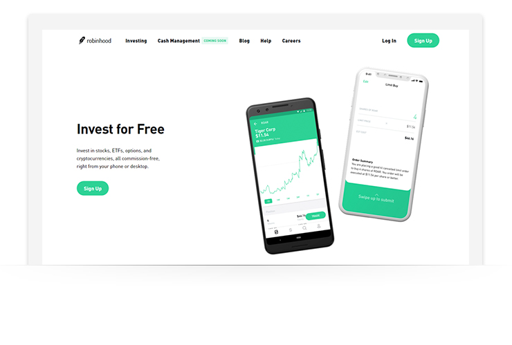
Check out this example of Robinhood is simple and powerful, due to strong headline:
Grab attention with landing page images
Making your offer a bit more visual helps attract the visitors to your offer, but the image has to be an eye-catcher this should be more enticing than the headline. Images are processed 60,000 times a lot faster than text by the brain.
Like headlines you should use imagery to attract the visitor's attention:
- If you are offering a product, the image should be of the product.
- If you’re offering a service, your imagery should relate to what the service is in a way that paints a positive picture in the mind of the user
Just remember that you do not have more than 30 seconds to gain the intended person's attention.
Make sure that the images are of high quality and large images. As a suggestion, we want to stay clear from stock photos. We want something that is not viewed very often.
Also, we Talk about the benefits of your service and product talk about why this potential customer should use your product or service. The benefits of opting in should be clear and precise, you should be able to explain how your offer or product can resolve their problems.
Your USP (Unique selling point) should be the thing that separates you from the competition and the reason why people should choose you over everyone else.
Value Proposition
Your value proposition should include the following:
- Showing how your product or service compares against a well-known competitor
- The ROI that can be achieved
- The monetary value of the product and the saving that can be made by signing up now
- The success that can be achieved
- Making it clear that your offer is free
- A guarantee
You should show the value your proposition has for their everyday needs and you should build your Landing page around it.
There you have it. Those are a couple of tips that I want to share with you to build stunning Landing pages and check out Aweber and look at their templates and choose how that can help your business grow.
Comments
Post a Comment